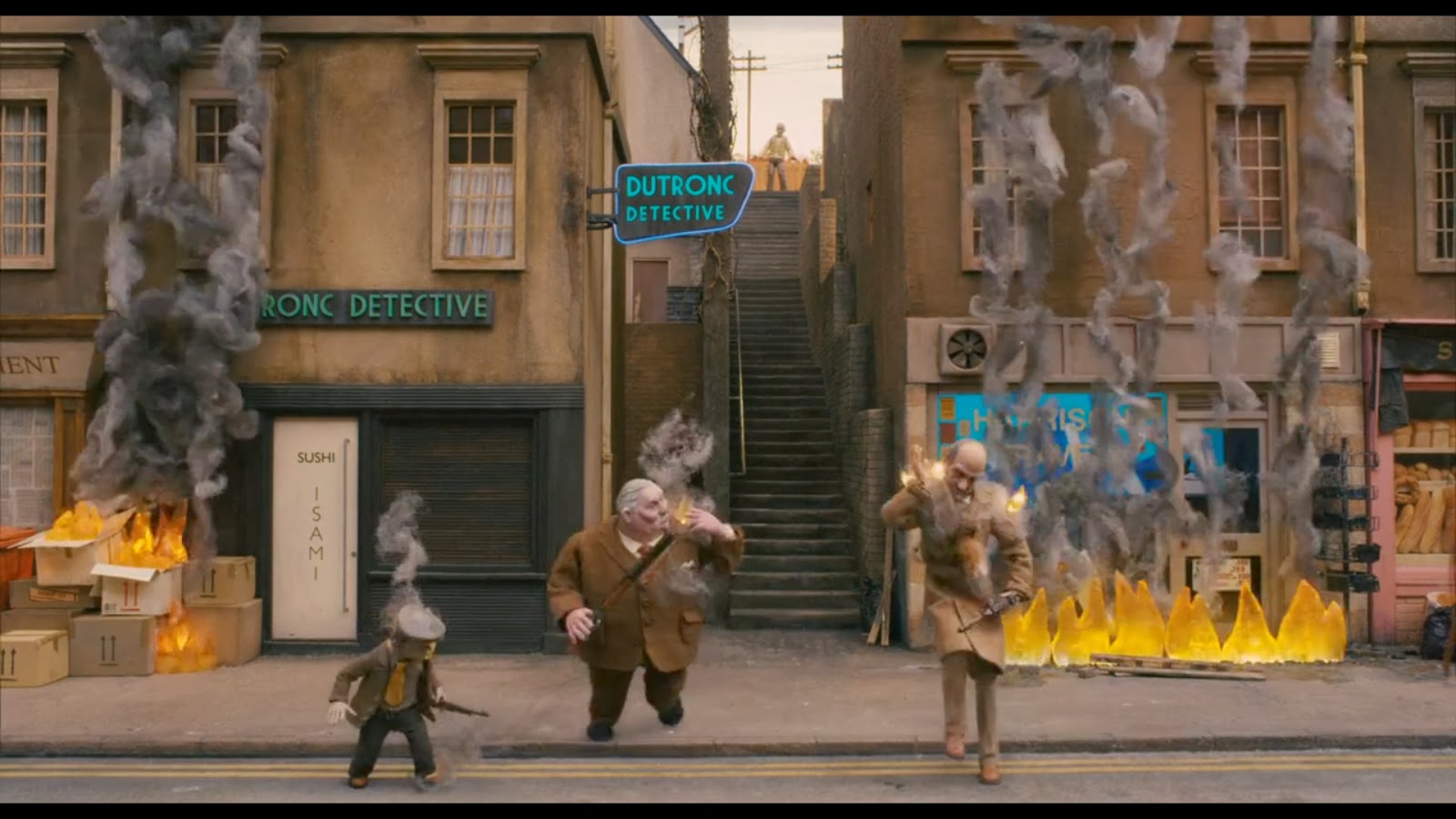
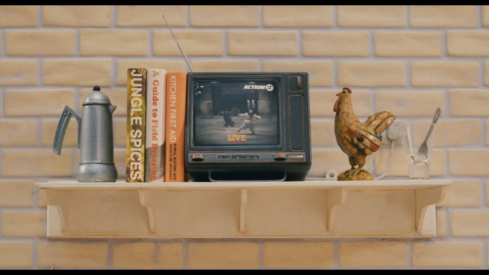
My final video can be seen here: https://vimeo.com/77555217
Monday, October 21, 2013
Rationale
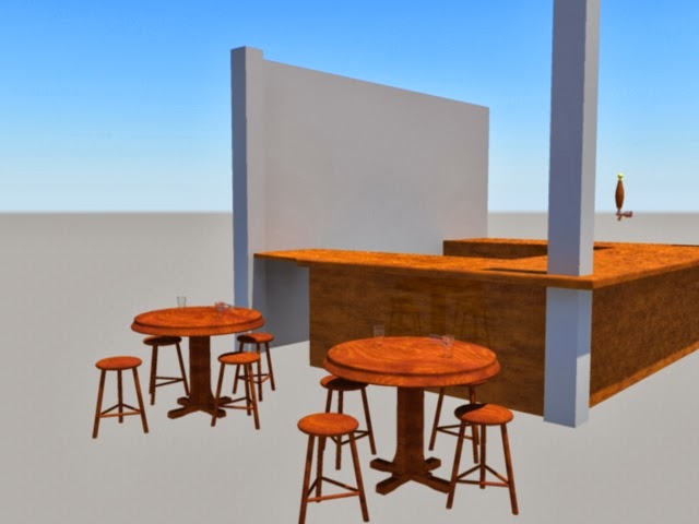
My final project works well for what it is. I would have loved to have a few more days to work on it and fill out the environment more (just a lesson in better time management really).
The camera shots found in Fantastic Mr. Fox are largely framed straight on and the camera is stationary. I tried to mimic this style of framing in my final video apart from the final shot in which I showed a larger portion of the environment. The tone fits with the movie with the simplistic styling and of course the overall yellowey-orange hue is present.
The positioning of some props inside the scene is intended to allude to the conflict scene near the end of Fantastic Mr. Fox (while also enforcing the fact that it is a venue which serves alcohol). This does not come across quite as clearly as I would have liked (again due to the lack of filling in the environment) but I think it does hint to it. The inclusion of some Bean Cider in the scene would have been a nice touch as well. In all though, the environment (mostly) demonstrates the intended goal.
Friday, October 4, 2013

Thursday, October 3, 2013
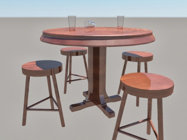
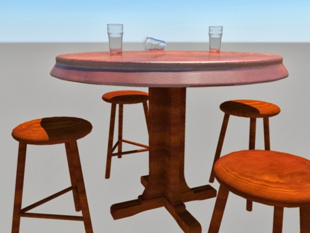
Some in Progress Renders
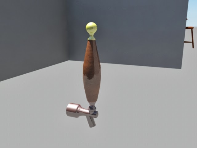
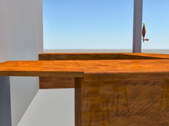
These images show some in progress work on my assets and some structure of the pub too. The duplicates show minor changes in shape or texture.
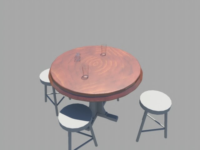
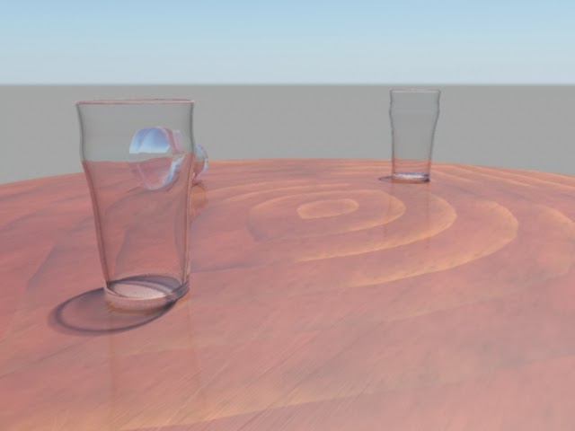
I just want to point out here: I am so happy with these pint glasses! :P


Thursday, September 26, 2013
Sketches
My initial Idea was to have all three floors of the Nag's Head.

Floor 1
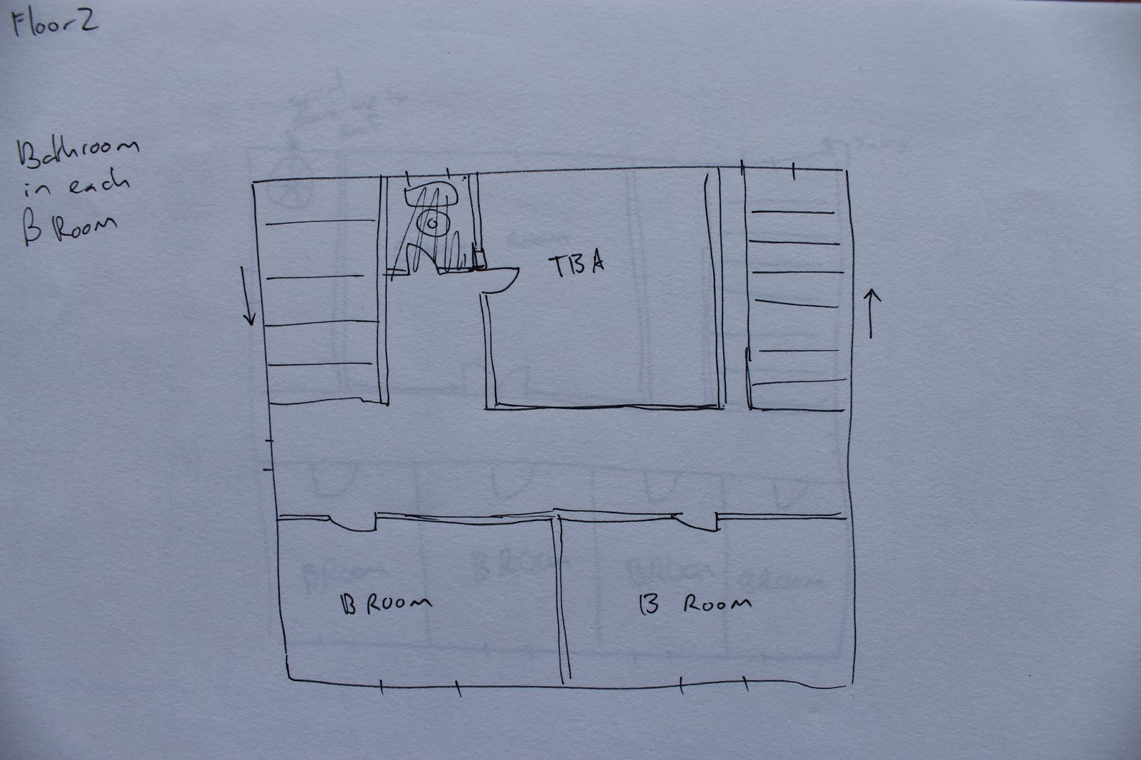
Floor 2

Floor 3
Then I realised this was far too much to show in 30 seconds, so I am now just going to do the first floor.

Revised first floor.
Here is a conceptual sketch of floor 1 from the right corner beside the front door.

List of interior elements for the Nag's Head
Furniture:
- Tables
- Chairs
- Bar Stools
- Sofa
- Pool table?
Decorative elements:
- Books
- Beer Glasses
- Beer Cans
- TV
- Clock
- Horse things (Nag's Head Pub)
- Model horse
- Nag's Head framed painting
- No smoking sign
- Shelves for the above
- Open fire
- Cash register
- Plates
- Cutlery
- Yellow/Orange incandescent bulbs with plain shades
- Key rack (for guest rooms)
Structural elements:
- White plastered walls
- Wooden supports
- Wooden rafters
- Stairs
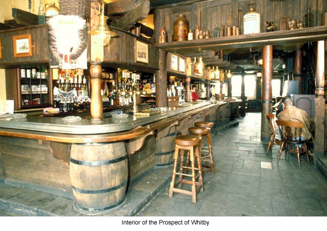
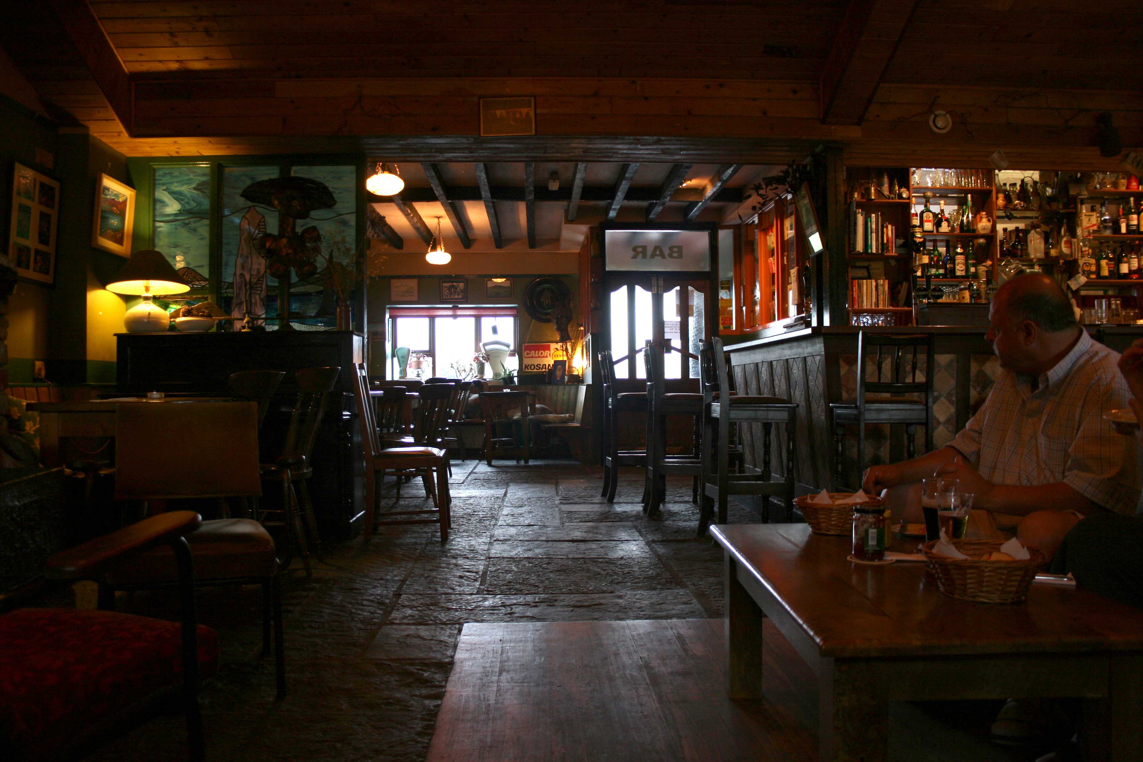
Pub interior inspirations
Here are some interior shots of various pubs. Below each image I'll explain what I would like to draw on.

I really like the texture of the floor and walls in this one and I think it suits the Nags Head.

This one has the same sort of lighting you might expect to see in the Fantastic Mr Fox.
This one has a sort of 'real' rustic feel to it. I don't think I will include any structural stuff but this is a good idea of what to include to make the space feel inhabited.
Good floors and furniture in this pub. This one also feels kind of 'cosy' and based on the exterior of the Nag's Head, that is what I am aiming for.

This pub has some good examples of structural supporting beams which I can draw from.
Thursday, September 19, 2013
Style examples and scene screenshots
The space I am extending is the Pub located in the town.
Some screenshots from Fantastic Mr Fox:

This is the first time we see the pub in the movie. It shows it has 2 stories and a high roof.
From here are inspirations or examples of the style I will be replicating:

The front of the fire station.

The game shop. This one is a good example of the interior spaces in the town of Fantastic Mr. Fox.

Top of Ferguson Cobblers. An example of a clock if I put one inside the Nag's Head.

Top of the Nag's Head. (I'm modelling the interior.)
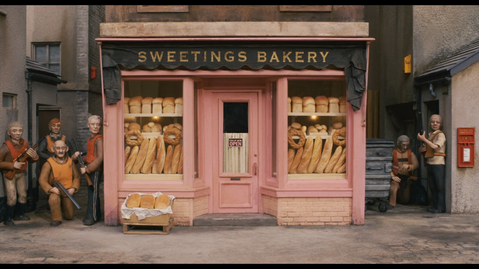
Le Bakery.

The travel centre.

The laundromat.

Pubfront.

Long shot of the whole front face of the Nag's Head.
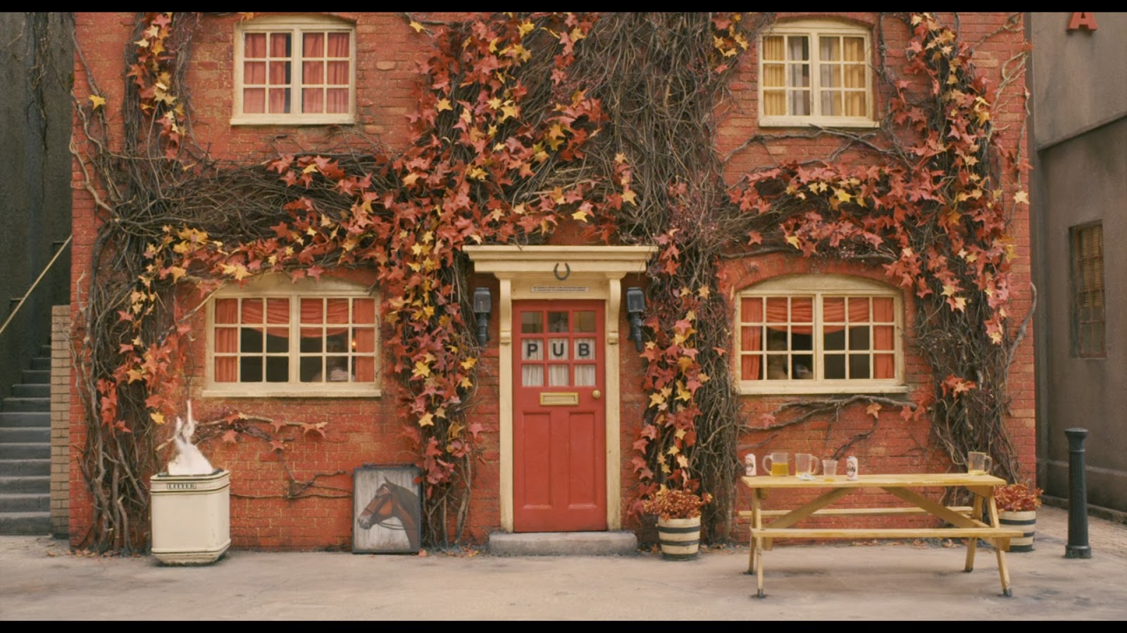
Screenshot of the front of the pub closeup.

Showing inside the door.
This is an example of the special effects in the film. If I want to have a fire going in the pub then I would model that of the effects here.
Some examples of interior ornamentation.

This screenshot is an example of the interior style in Fantastic Mr. Fox
Sunday, August 25, 2013
Rationale
My research revealed that Humpty Dumpty was a drink in which brandy was boiled with ale from the seventeenth century. It revealed that a Humpty Dumpty was a short and clumsy person, and that it may refer to king Richard the 3rd of England. I also learned what reduplicative meant (not in realtion to the animation but it was interesting to find out none-the-less).
My opinion on the popular interpretations of Humpty Dumpty have remained largely unchanged. By that I mean I don't really have an opinion. It was interesting to learn however that this rhyme used to be a riddle, but overtime the answer became so well known that this aspect of it has become lost.
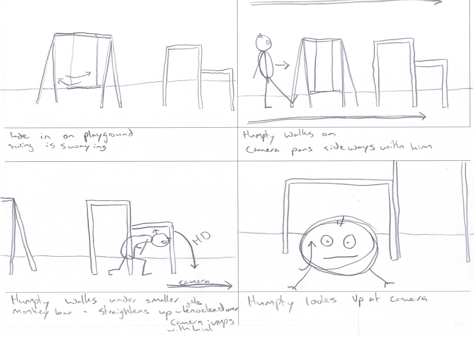
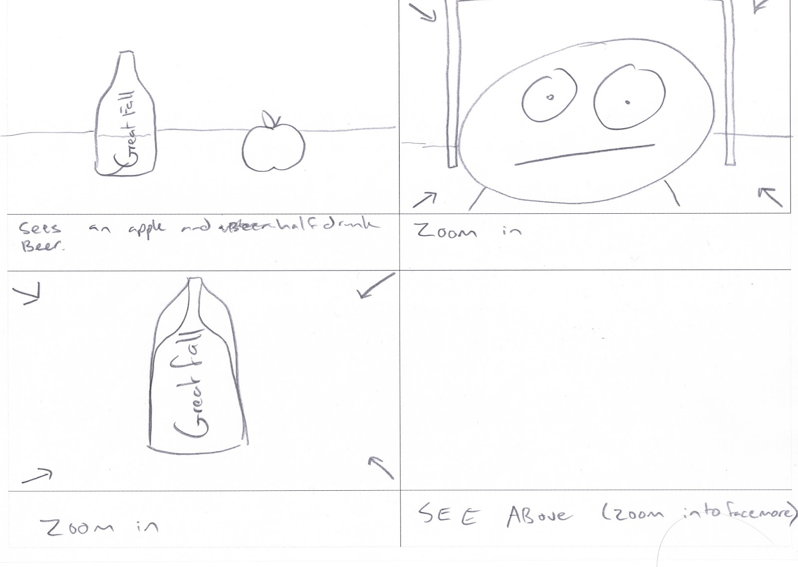
I have interpreted this rhyme into the modern context by taking a message from our binge drinking culture and trying to portray the dangers of too much alcohol in a friendly humorous way. I have also used a 'modern' playground item - the one person duck seesaw.
I chose to show the story this way because A) I like to entertain people with whatever I make and B) people are generally more open to a humorous message (in my experience).
I chose to use the font 'THOR' for the great falls alcohol bottle, I used a bold 'Arial' font for the landmine sign, and I used 'Boom Tank' for the boom onomatopoeia. I looked at various beer bottle labels and based on what I saw from then I chose to use THOR because it fits with that style of banner. Arial is a clean font that is easy to read quickly. It is also used on many large outdoor signs for this very reason. "Boom Tank' had the shattery styling of an explosion so I capitalised it and bolded it, then animated it and I think the effect worked well.
I decided to give the animation a very light feel and use no music in it, just straight sound effects. I wanted to let the audience concentrate on what was happening on screen rather than listening to a possibly distracting extra layer of audio.
Final Animation
Here is the link to my final animation on Youtube: http://youtu.be/z7_Jiea1IKY - (watch in 1080p FTW)
Wednesday, August 21, 2013
Animation Style notes
I decided to keep an idea I had earlier on and make this mostly a side scroller of an animation.
In terms of character design, I still have not managed to find the name for the inspiration I had or an example of it, but it is where the face of a character is sideways and you can see both eyes and the mouth on that side of the face.
I think movies that mix reality and animation together have a nice feel to them so I am trying to recreate that feel with my project. This is just one example of someone elses work: http://vimeo.com/11984027 adding 2D to live action. I don't think mine will make it quite up to that standard, but that's the sort of thing I'm aiming at.
For the sound design I'm thinking of using plain sound effects, just keeping it free from music and allowing the audience to focus on the events of the animation.
Tuesday, August 20, 2013
Slight changes
There have been some slight changes, which I think are not all that worth storyboarding so I will just note them here.
As I was animating the story I had a number of ideas which I think made the story flow better such as:
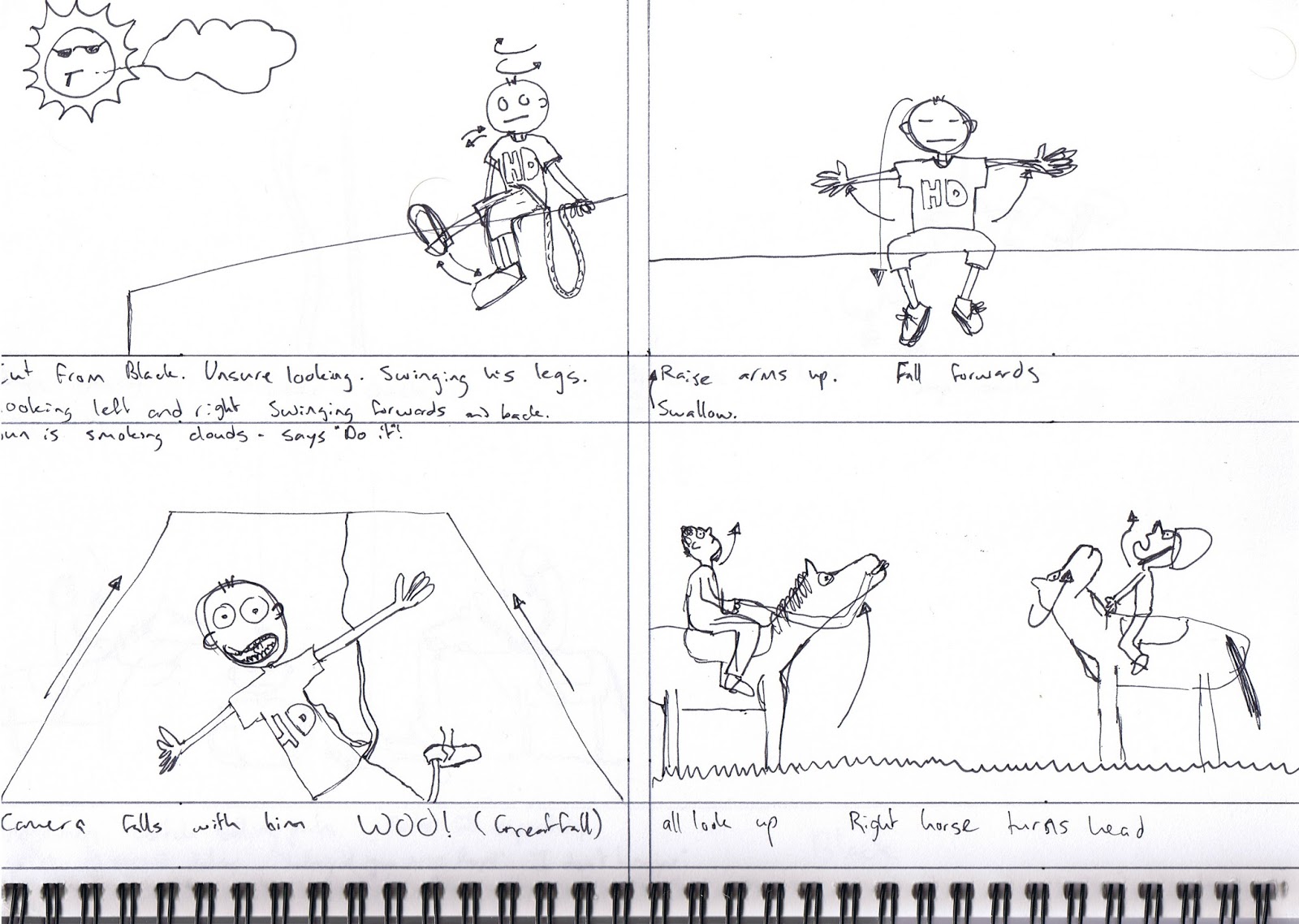
- Starting with Humpty actually sitting on a wall
- He sees a great fall from the wall then drinks it
- rather than monkey bars which he ducks and knocks his head, have it be one of those single person seesaw things (then in addition to having the great fall (beer) he can have a great fall and fly off the seesaw out of clumsyness and with the effect of the beer taking place)
- cut out the skateboarding (that was a placeholder anyway)
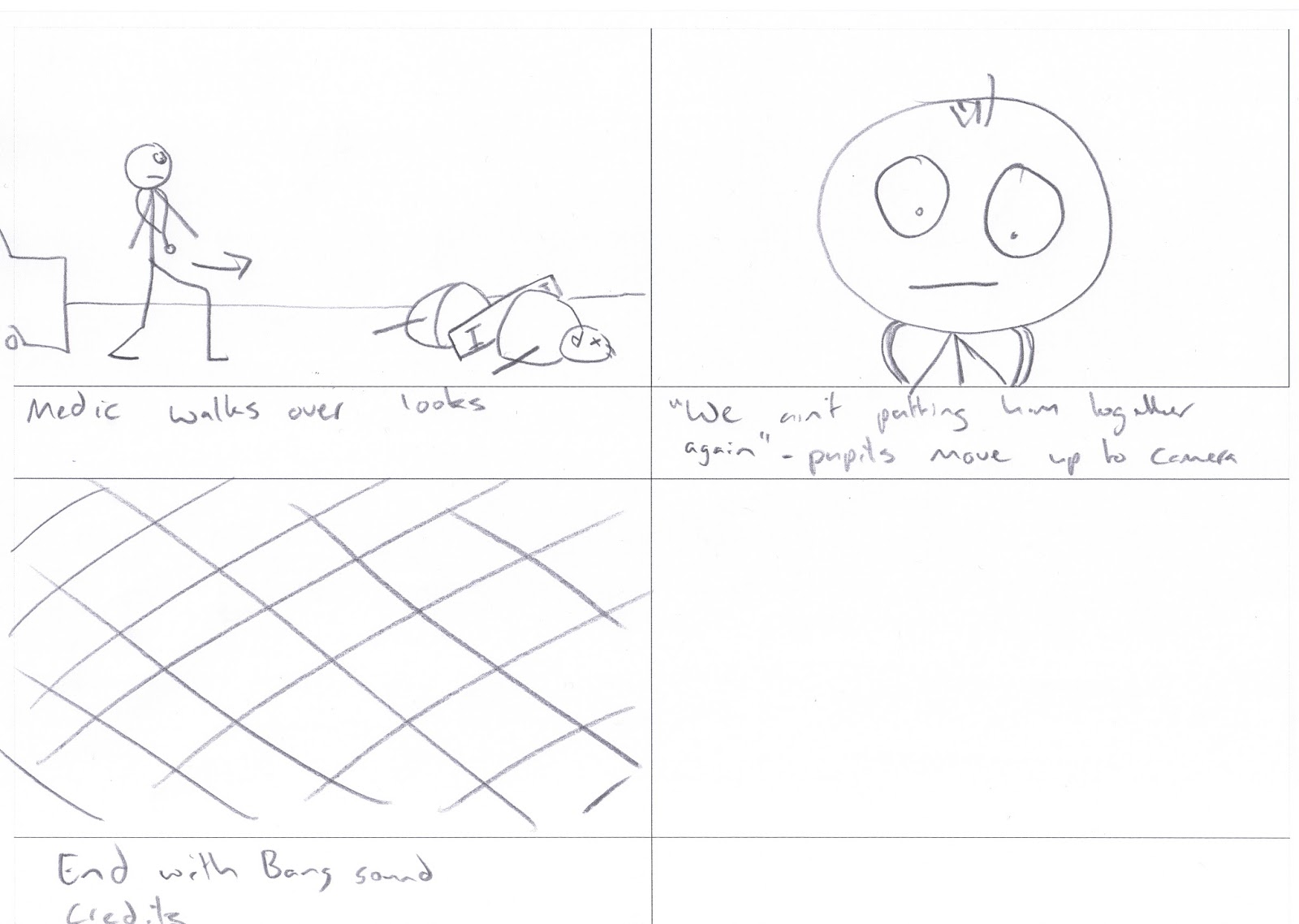
- no ambulance - just a newspaper article stating that experimental horse medics failed (like an idea in my earlier brainstorm)
- have it culminate in a minefield testing facility beside a kids playground (because why not? it is an animation after all - things can get crazy)
There you have it. I suppose there are a few changes, but as I'm nearly through the animation now I don't think a modified storyboard is necessary.
Friday, August 16, 2013
Thursday, August 15, 2013
Character sketch
This is a sketch of the humpty dumpty character. I've styled him after the art style where they put all the features on the front of the body - flattening out a 3d object - though I really can't remember the name of this style.

The horse at top was a quick sketch from when my animation was to have horses in it.
Wednesday, August 14, 2013
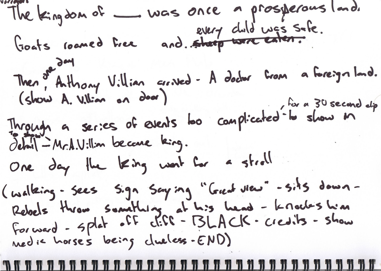
Yet another story change
As I sat down to storyboard my last idea I thought it was too complicated for a 30 second clip, and would also require a great deal of asset creation and animation. So with thinking this I then proceeded to come up with a new idea.
This idea initially took inspiration from the fact that in the Oxford English Dictionary "humpty dumpty" refers to a drink of brandy that was boiled with ale in the seventeenth century.
I also made use of the fact that Humpty Dumpty was eighteenth-century reduplicative slang for a short, clumsy person.
So I mixed beer with clumsy person and came up with the idea that I could use this animation to show the bad effects of over drinking (in a humorous way of course).
With it being a small clumsy person who drinks the audience also won't mind that he will inevitably die :P (or at least that is my thinking anyway)
This can be seen in the storyboard below:

Friday, August 9, 2013
Slight change and style update

I have decided I want the animation to be strongly influenced by side-scrolling games. I'd like to be all in one camera shot as well.
Another Style Example
I have always like the style of Aardman's characters such as Wallace and Gromit and would like to design the characters to be somewhat like theirs.
Some more animation style precedents:
Pythagosaurus:
Monty Pythons Flying Circus animation:
Tuesday, August 6, 2013
Idea Narration
I settled on the idea of having Humpty Dumpty being a bad guy. This would mean that with his inevitabl;e demise the audience wouldn't feel bad that he couldn't be fixed.
I went with this from my second brainstorm.
Idea changed again
After going back to my story again, I didn't really like it as much as I thought so I went back to the brainstorming stage.
Here's the storm of brains:


The inspiration for this second brainstorm came when I read this online:
"One [theory] advanced by Katherine Elwes Thomas in 1930 and adopted by Robert Ripley, posits that Humpty Dumpty is King Richard III of England, depicted in Tudor histories, and particularly in Shakespeare's play, as humpbacked and [a king] who was defeated [in battle]."
Saturday, August 3, 2013

Thursday, August 1, 2013
Week 3 - Exercises
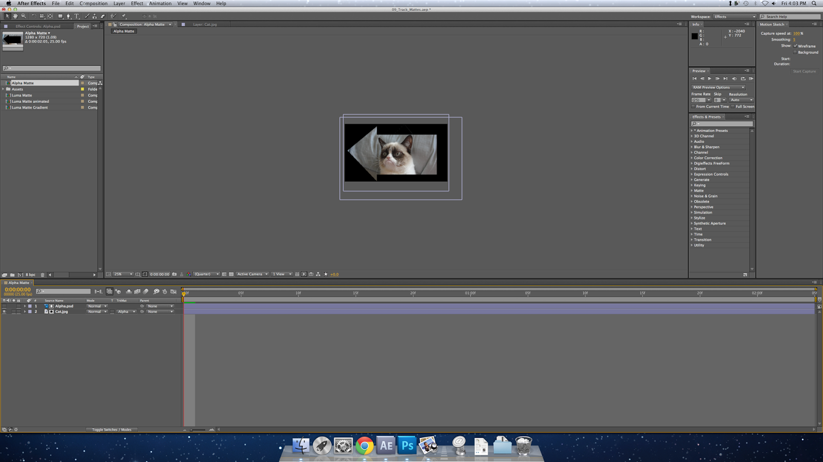
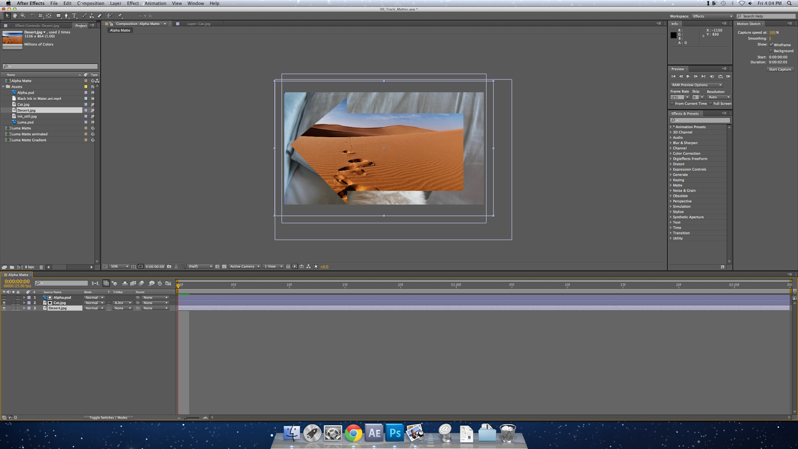
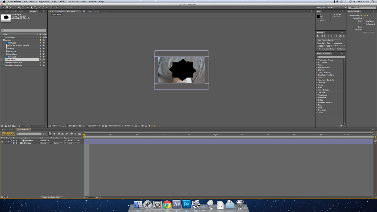
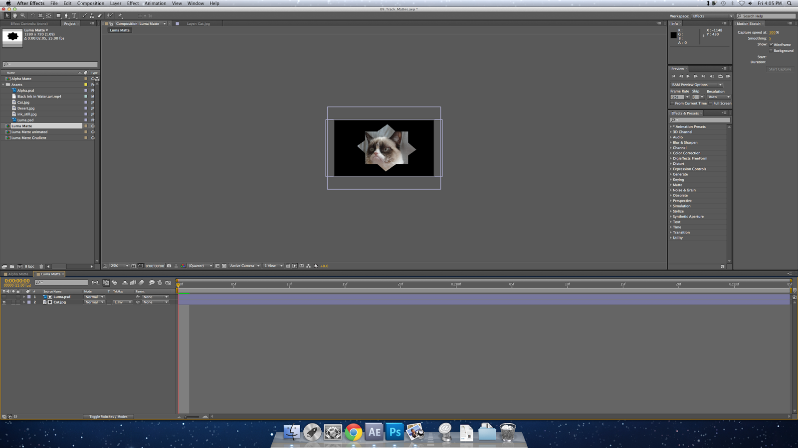
Here is what I did in class today documented in screenshots:

First of all I got a storyboard from google then cut it up into segments.

Then I animatic-ed it

Adding markers.

Deleted everything and made a shape layer.
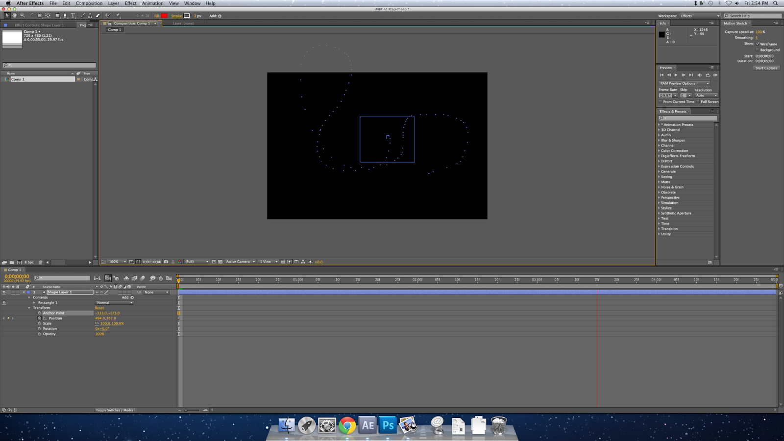
Then I created a freeform scribble path for the shape to follow.
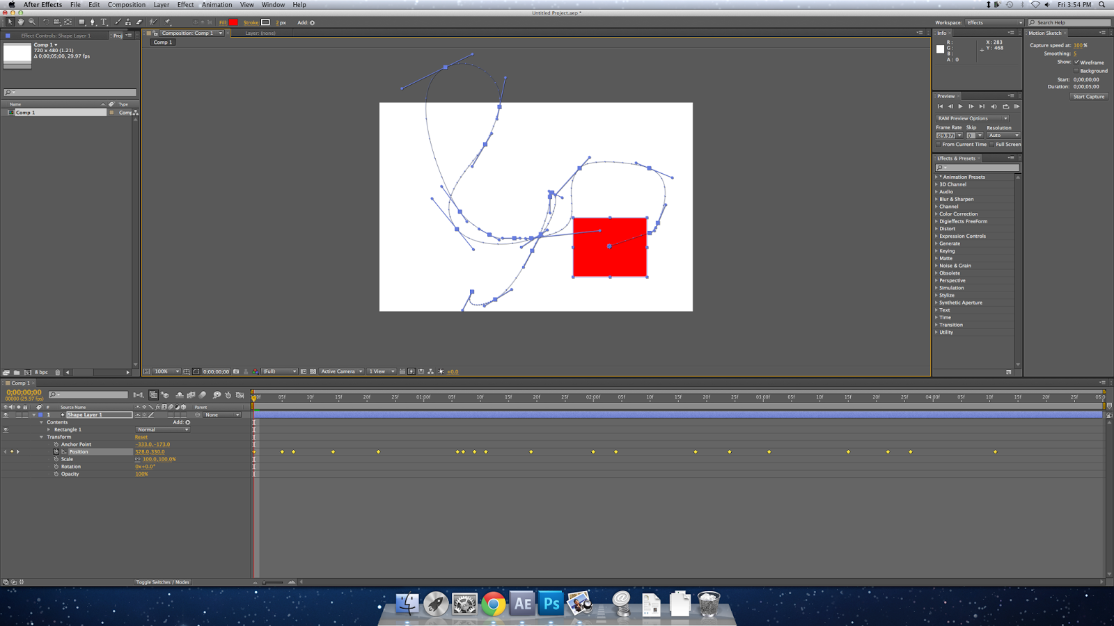
This screen shows all the editable parts of the path.

From here I'm playing with different ways to mask things (and also applying some styles near the end).

Subscribe to:
Posts (Atom)